01
Project overview
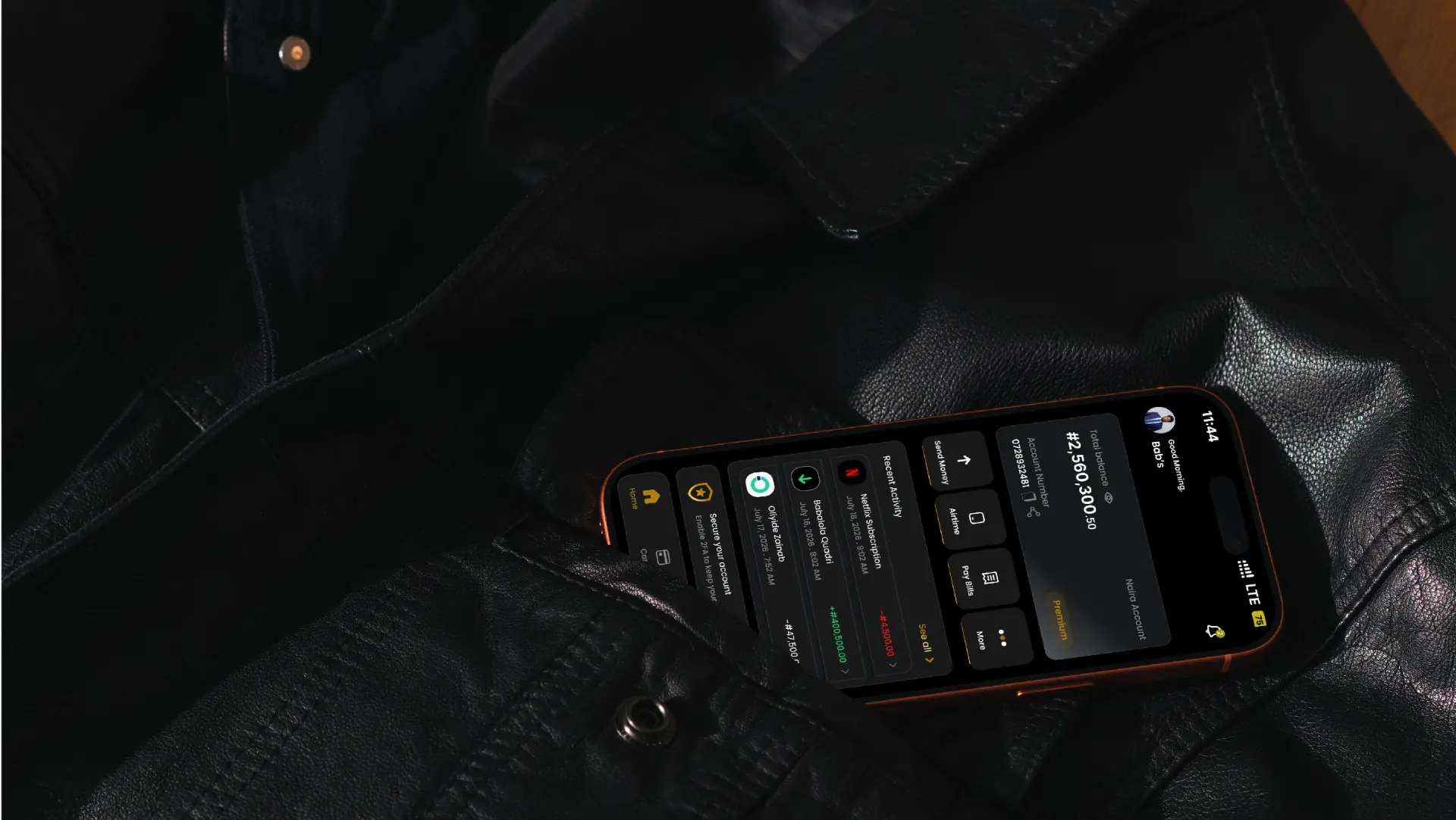
Baiz Bank is a mobile banking app concept focused on making everyday banking easier to understand and navigate. The project explored how a banking interface could help users access important features without feeling overwhelmed by too many options or complicated steps.
My focus was to design an experience that feels clear and organised, especially for adults and older people who may not be confident using digital banking services.
02
The problem
Banking apps give people access to important financial services, but the experience is not always easy to understand. When users struggle to find the right feature or understand what a screen is asking them to do, even a simple transaction can become frustrating.
This can be a bigger challenge for adults and older people who are less familiar with digital banking. If the interface feels confusing, users may hesitate before completing a transfer or worry about making a mistake.
For me, the challenge was not simply to make another banking app look attractive. It was to explore how the design could make everyday banking feel more straightforward and help users understand what to do at each stage.
03
Project goals and understanding the users
The main goal was to create a mobile banking experience that puts clarity and ease of use first.
I focused on four key areas:
- Simple navigation: Make important banking features easy to locate.
- Straightforward transactions: Organise the transfer process so users can follow each step with less confusion.
- Clear information: Present balances, transaction details and other important information in a way that is easy to scan.
- Accessible design: Consider adults and older people who may need clearer labels, readable text and a more predictable interface.
The project also included the idea of zero interest charged on transfers. This was part of the intended banking proposition rather than a verified or launched service feature.
I used these goals to guide the design decisions and determine which features deserved the most attention.
04
Research and key insights
Before starting the interface design, I reviewed existing fintech and mobile banking apps to understand how they organised their features and presented common banking tasks.
One thing I noticed was that many of the apps I reviewed followed similar interface patterns. This gave me an opportunity to explore a different presentation while keeping familiar banking actions easy to recognise.
The competitive review helped me focus on three design considerations:
- Finding features quicklyUsers should not have to search through several screens to locate common actions such as transfers and other everyday banking services.
- Understanding financial informationBalances and transaction details need a clear visual hierarchy so users can identify important information without unnecessary effort.
- Feeling confident during transactionsThe interface should guide users through a task in a logical order. Important information should be easy to review before a transaction is completed.
These were design considerations drawn from my competitive review, not claims that all banking apps have the same problems. I did not record quantitative research findings or performance metrics for this project.
05
Information architecture and user flows
After the competitive review, I organised the main features around the tasks users would likely need to complete.
The experience covered account access, the main dashboard, transactions and spending information. I considered how users would move from one screen to another and how the layout could make the next action clear.
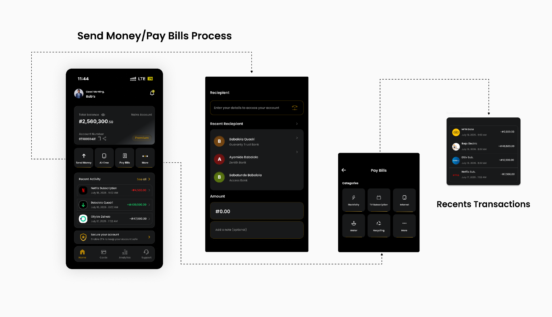
The dashboard was particularly important because it serves as the starting point for many banking activities. I gave attention to the placement of the account balance, common actions and recent transactions so that key information and features could be recognised quickly.
I also considered the order of steps in the transfer journey. A banking task should feel structured rather than leave users guessing about what to do next.
Mapping these flows before developing the visual interface helped me establish the structure of the experience before concentrating on its appearance.
06
Design process and visual direction
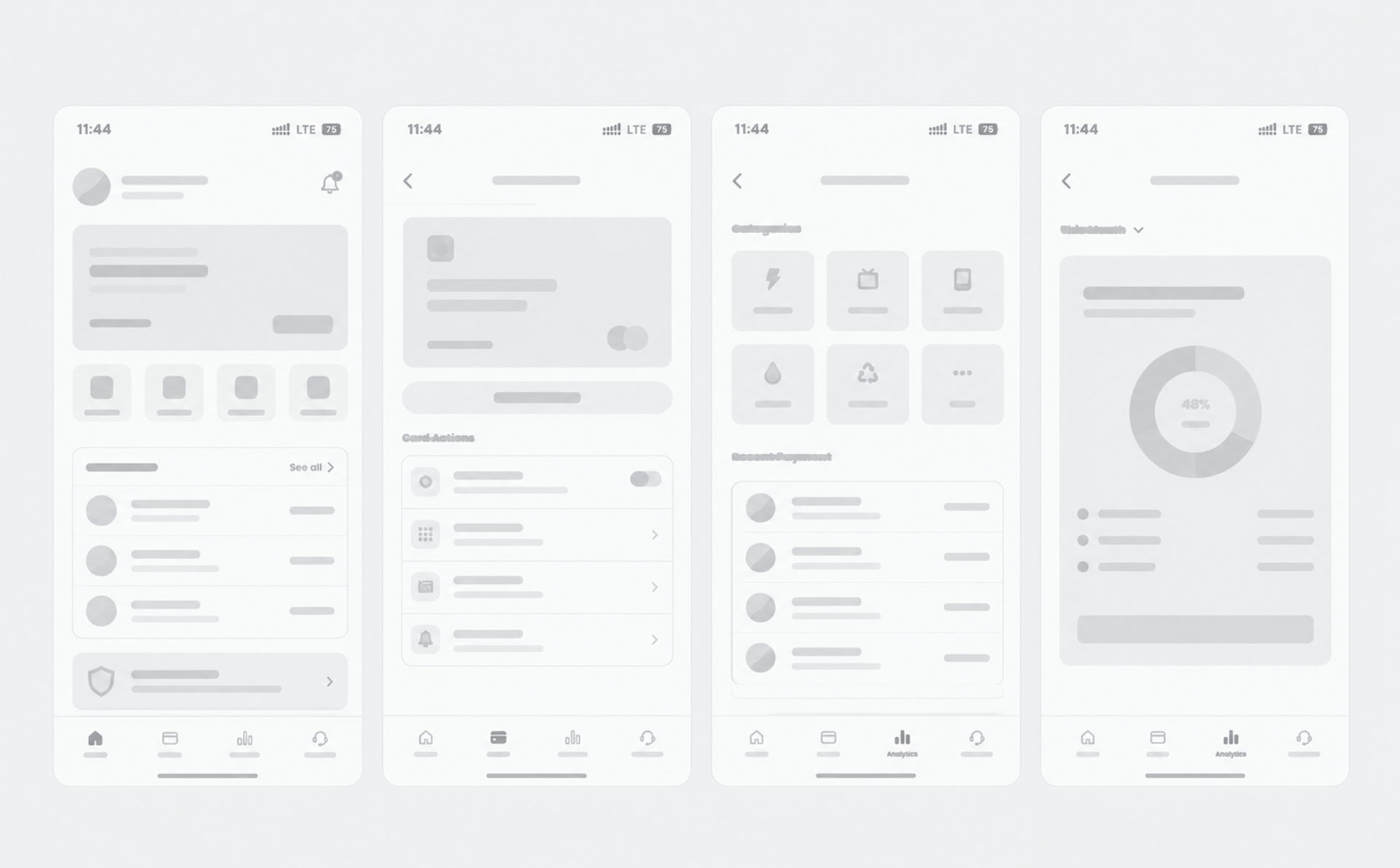
With the main flows established, I moved into wireframing and interface design. This allowed me to explore screen layouts and information hierarchy before refining the visual details.
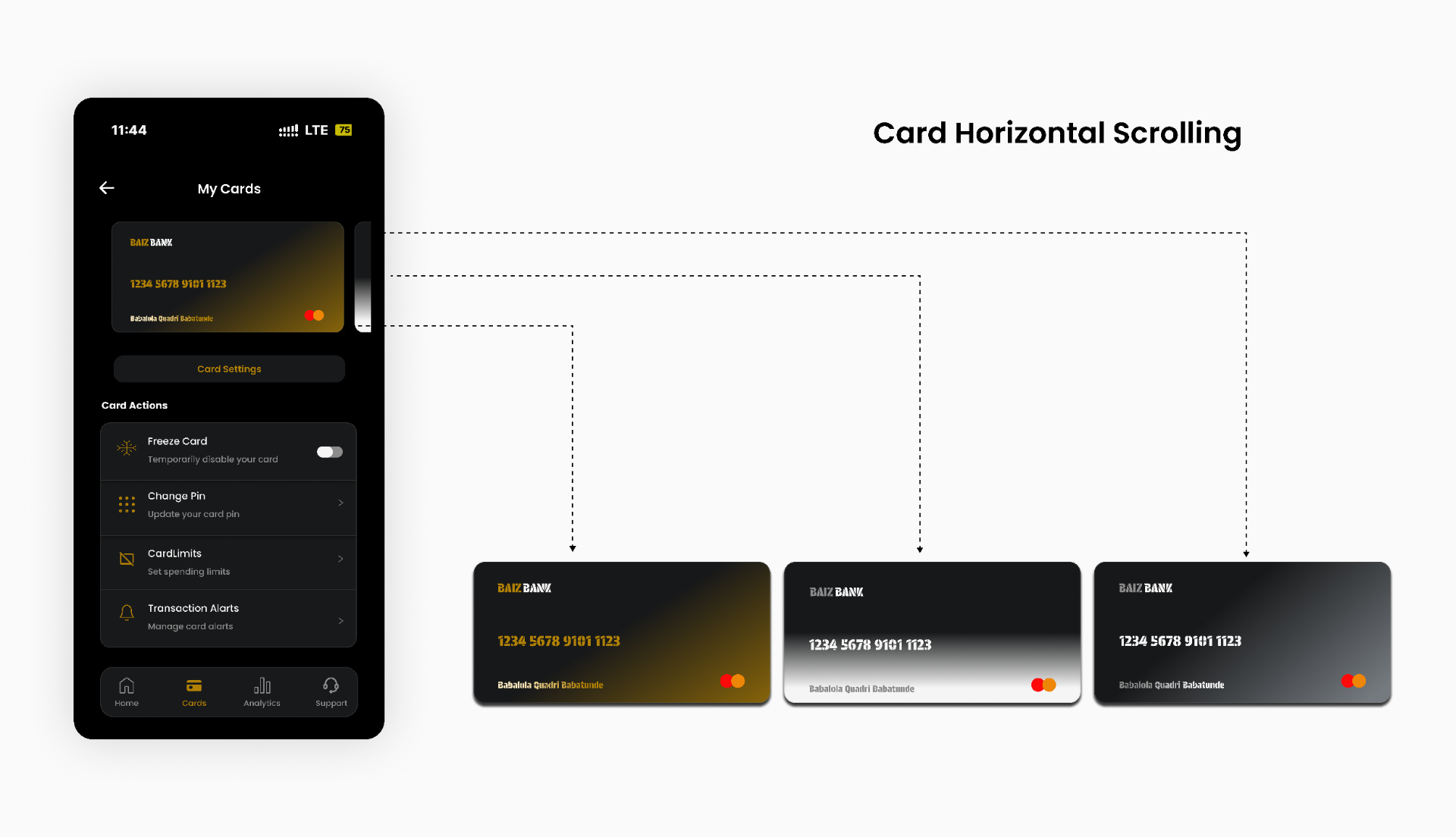
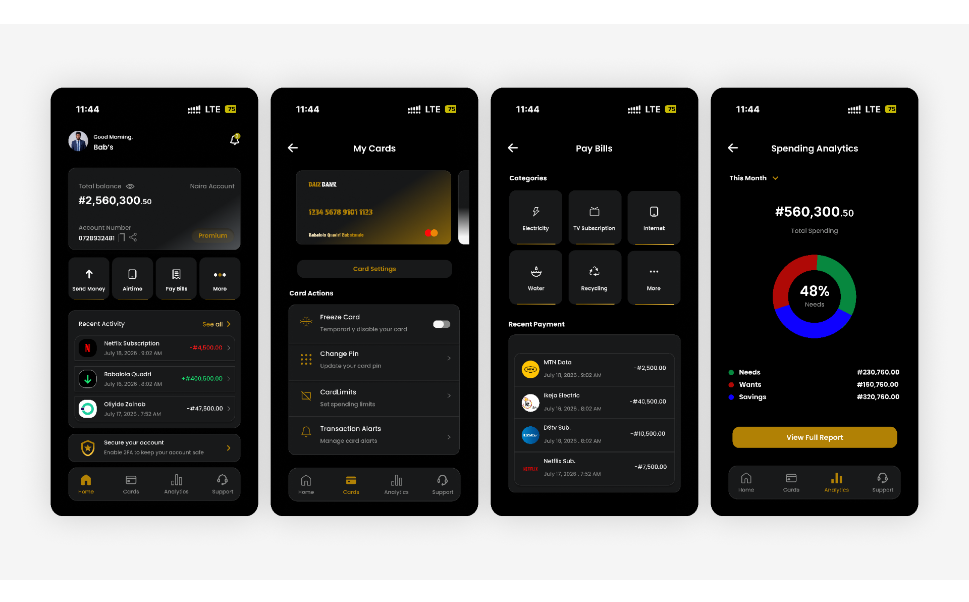
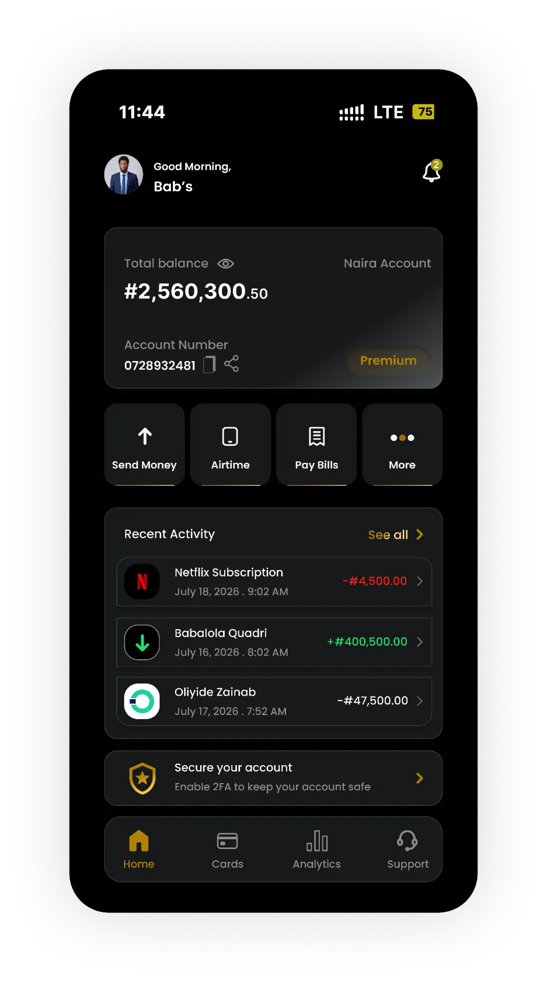
For the visual direction, I used a dark interface with gold accents. The intention was to give Baiz Bank a distinctive and polished appearance while maintaining a clear separation between important information and supporting elements.
I paid attention to spacing, alignment, typography and the placement of interactive elements. These details matter in a banking app because users need to understand the information presented to them and recognise the actions available on each screen.
Rather than treating every element as equally important, I focused on giving key information and actions enough visual emphasis. The aim was to create an interface that felt organised without making the screens unnecessarily busy.
The visual direction was a design choice for the concept. It was not evidence that users preferred a dark interface or that the colour palette improved usability.
07
Key screens and design decisions
The main screens were designed to support the core banking journey, from accessing an account to viewing financial information and managing transactions.
Onboarding and authentication
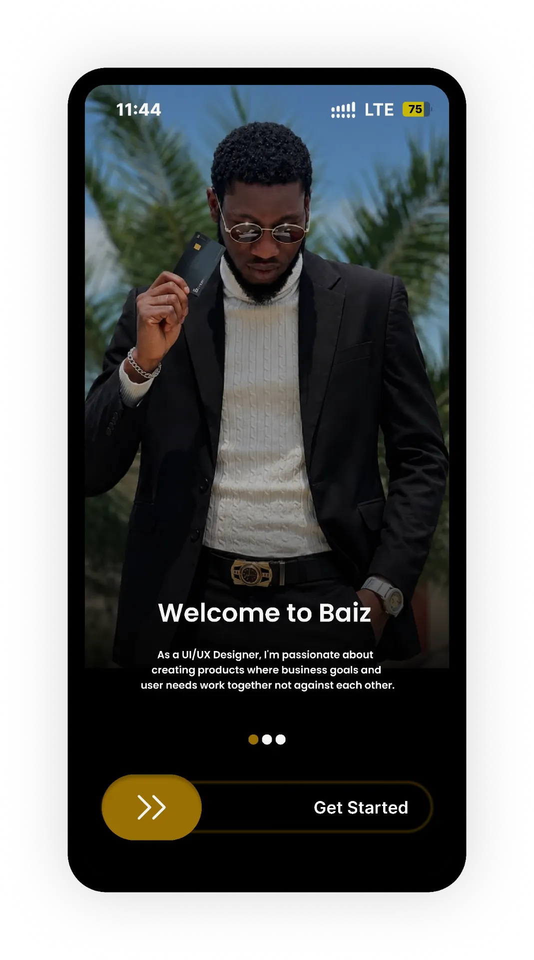
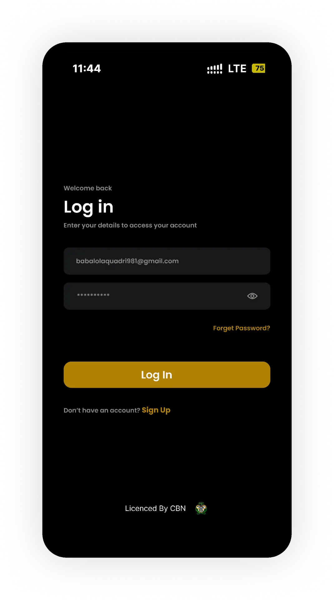
These screens introduce the experience and provide the entry point for users. My focus was on making the initial steps understandable and keeping the account access journey organised.
Dashboard
The dashboard brings important account information and common banking actions into one place. I treated it as a central part of the experience because users should be able to understand their account overview and identify where to go next.
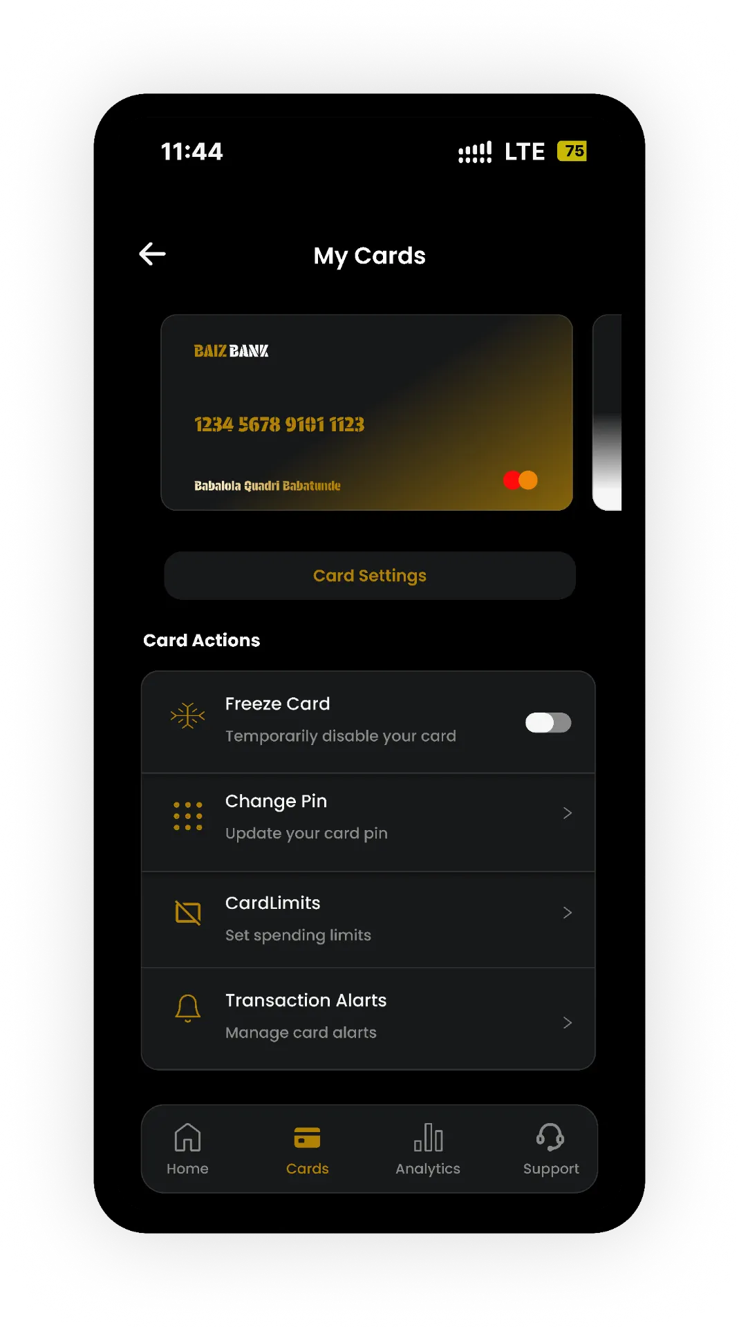
Transactions
Transaction screens support everyday banking activities. The design focus was on presenting the necessary information in a logical order and making the actions easy to identify.
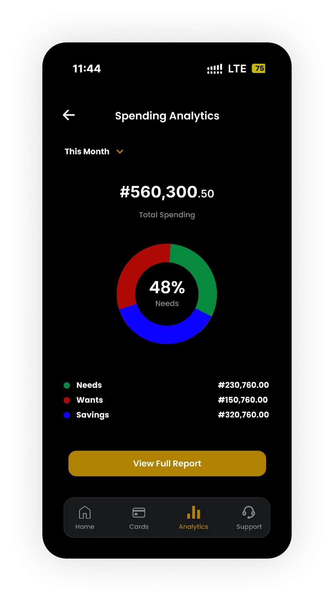
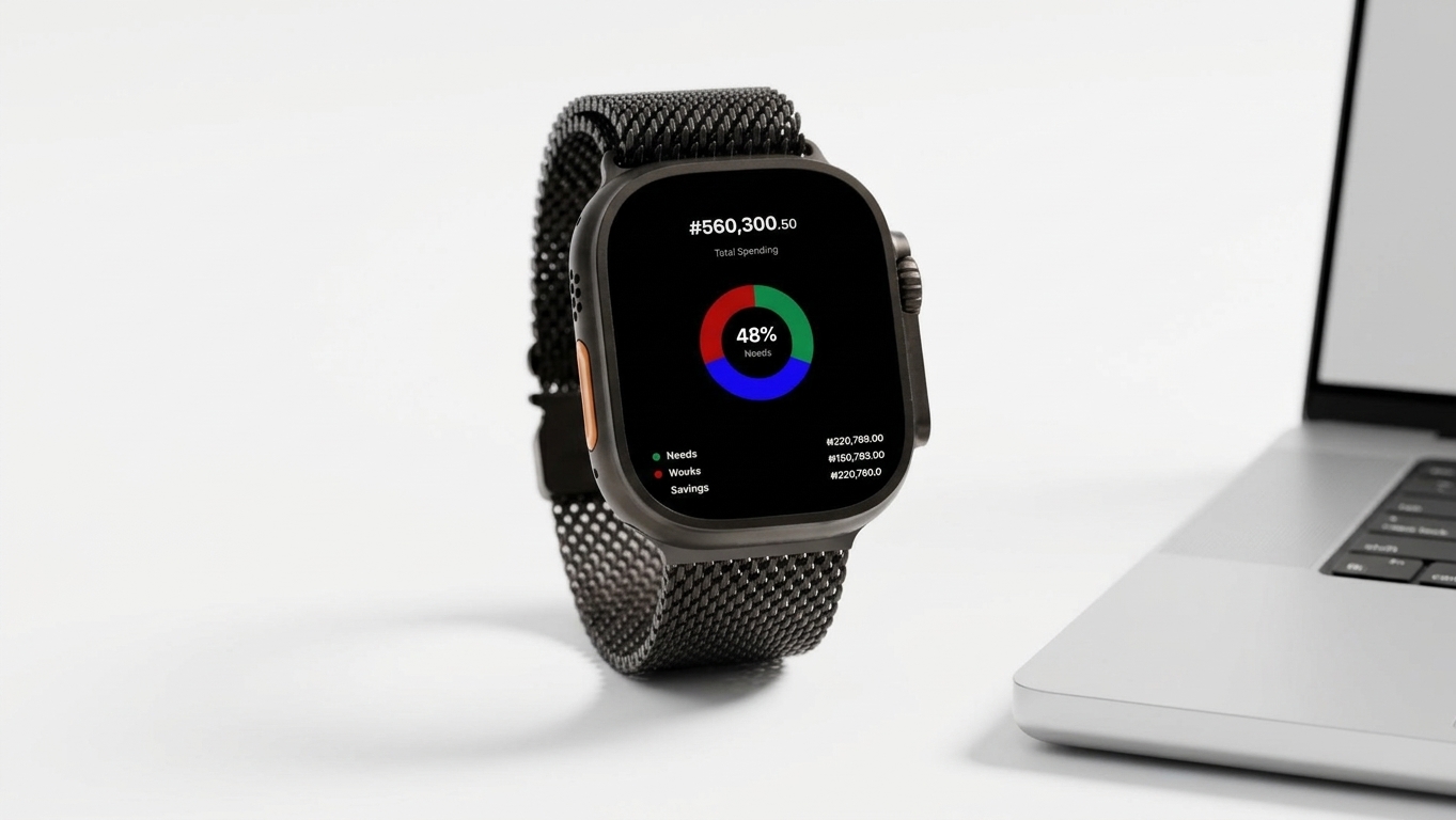
Spending insights
Spending information gives users another way to review their financial activity. The design needed to present this information clearly enough for users to understand what they were viewing.
Across these screens, I aimed to keep the experience consistent. Familiar layouts and clear labels can help users build an understanding of how the app works as they move between features.
08
Prototyping, usability testing and limitations
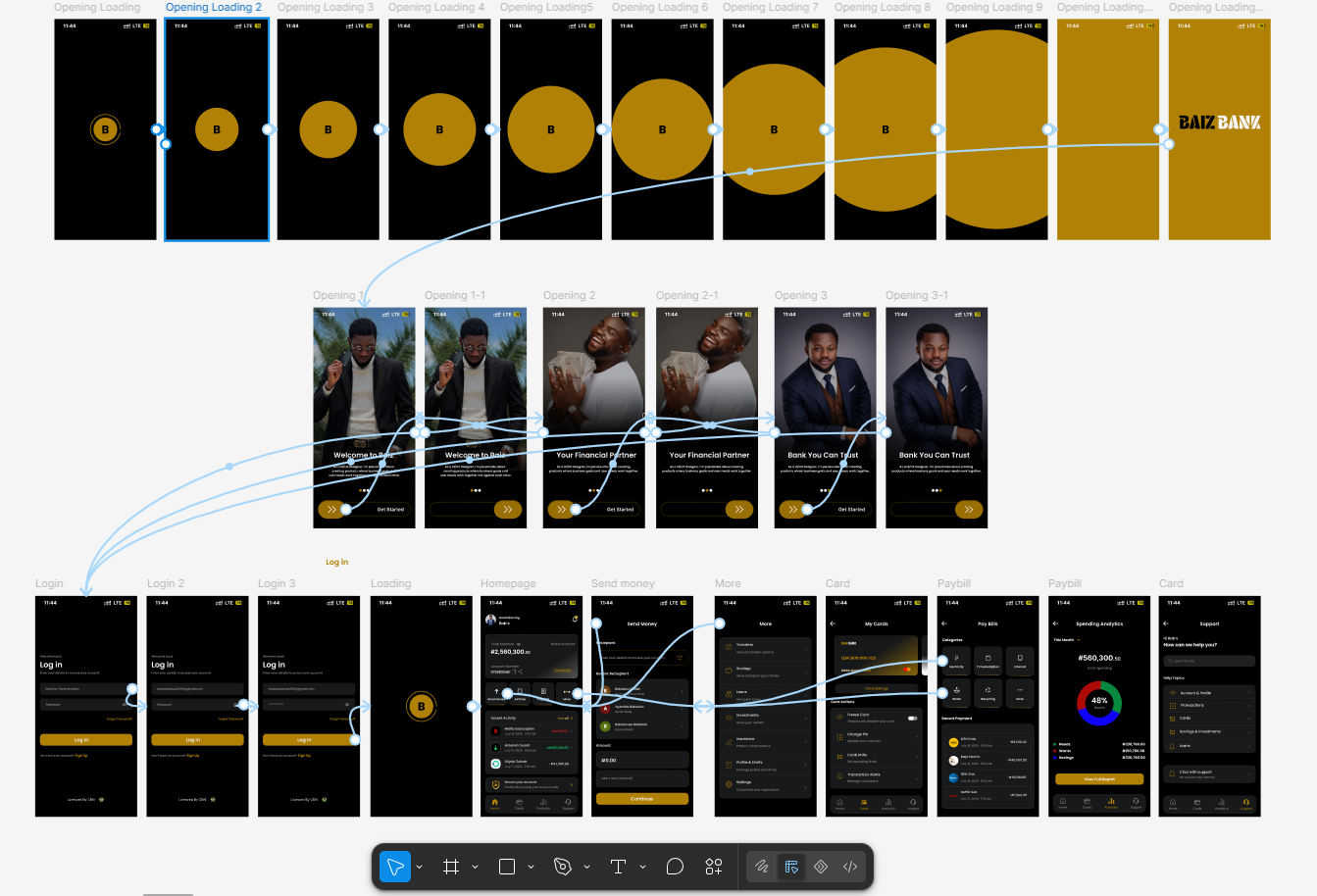
After designing the main screens, I created a prototype to connect the interface and demonstrate how users could move through the experience.
Usability testing was included in the project process to examine how people interacted with the design. However, I do not have documented participant numbers, detailed test findings or measured improvements to report. I therefore cannot claim that the design reduced transaction time, improved trust or made banking easier by a specific percentage.
The project also remained a concept. The proposed banking features, including zero interest on transfers, were not presented as a verified live financial service.
Next steps
If the project were to continue, I would conduct further usability sessions with adults and older people with different levels of digital confidence. I would observe how they complete common tasks, where they hesitate and which parts of the interface need improvement.
I would also investigate accessibility requirements, validate the proposed banking features and work with the relevant financial and technical teams to understand the requirements for a real banking product.

09
Final reflection
Baiz Bank gave me an opportunity to explore a challenge that matters in digital product design: making an important everyday service easier to understand without adding unnecessary complexity.
The project reinforced my view that a banking interface should do more than display financial information. It should help people recognise their options, understand the task in front of them and move through the experience with greater clarity.
My work covered the competitive review, user flows, wireframes, interface design and prototyping, with usability testing included in the process. Although I do not have measured results to demonstrate the impact of the design, the project helped me think more carefully about information hierarchy, navigation and the needs of users who may find digital banking difficult.
The most important lesson
For me, the most important lesson was that a polished interface is only part of the solution. The design also needs to make sense to the people using it. That principle guided my decisions throughout the Baiz Bank project.